Nine web design tricks you need to know today!

Nine web design tricks you need to know today! Image Source
Today’s world is all about digitalization- the pandemic has not just made us stay-at-home workers but order-online buyers as well.
Capturing an audience and effectively generating leads is how you will outshine your competitors.
Be the Ace at Developing Your Ideal Website.
If you want the desired ROI and successful branding of your business, make your website a platform that impresses the mass.
Follow our nine nifty web design tricks and get ready to experience higher milestones. Let the guide begin!
Planning Before Execution Pays off
Behind every masterpiece is a well-written plan. You can’t just jump face down into the water without knowing its depth and the dangers that might be involved.
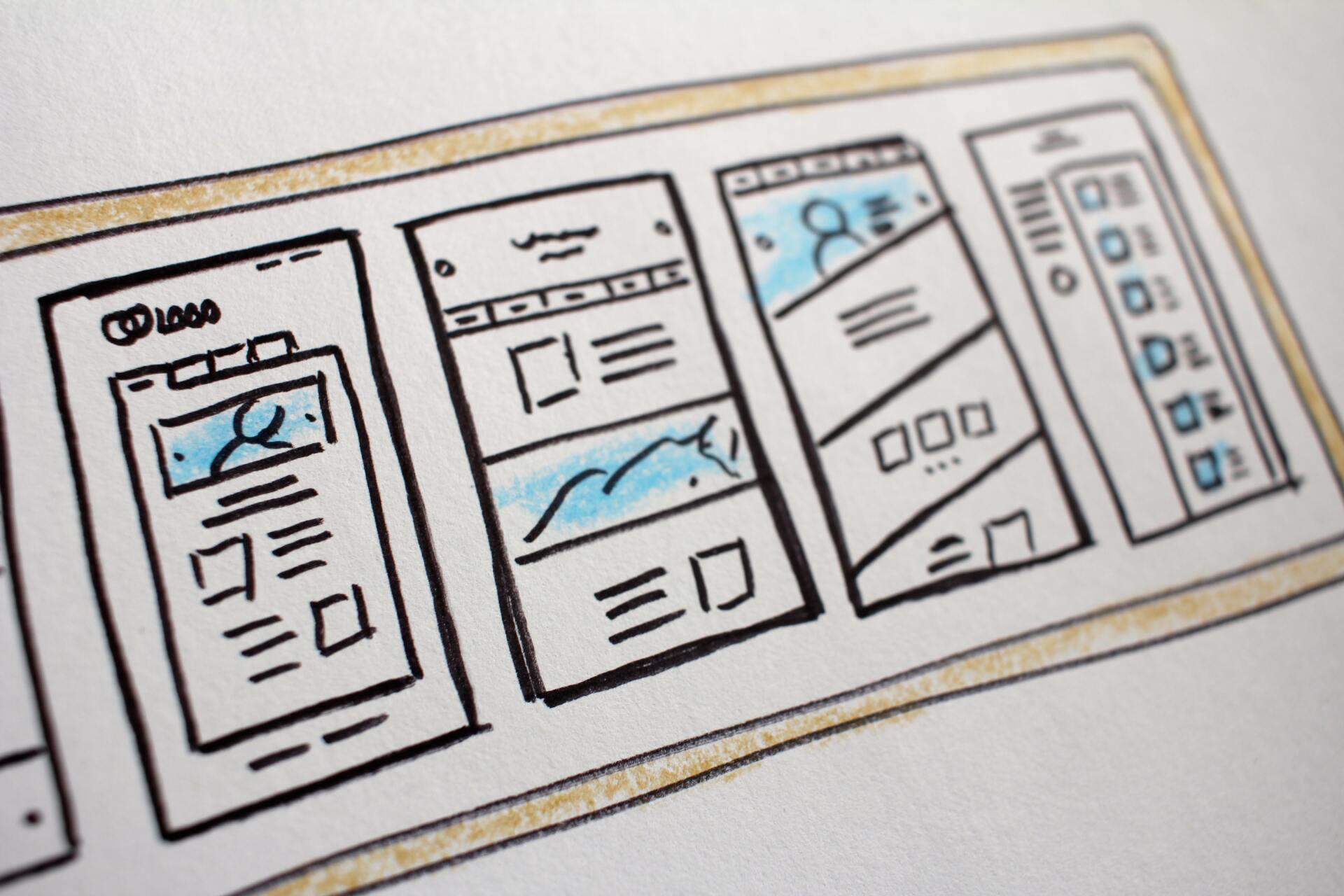
So, if you desire to be a pro at web designing, first take out a pen and paper-
Because it's 2022, let’s say, open a blank document and mind map.
List down your requirements, understand the objective behind your website, think of the possible styling you want to incorporate in your web. These are the fundamentals.
Once you know your demands, that will help you proceed with the actions you must take to fulfill them. It’s making a vision of your ideal website that will help you save time, confusion and structuring your web.
Include Links to Your Social Media Pages
Adding buttons for your social media accounts helps your consumers connect with you even more.
More than 50% of the world population uses social media platforms in this globalized world- irrespective of their age. Thus, allowing your traffic to reach out to you using numerous digital media platforms is vital for earning more leads.
Click to Actions are a Necessity.
One cannot stress enough the significance of Call to Actions. CTAs are crucial for boosting the chances of successful leads. If you want to raise your conversion rates, CTAs save your day- truly.
Aside from the primary CTA, including catchy phrases all over the website is vital. Make sure you place the CTA buttons or links where your users can read them clearly.
If the call-to-action buttons aren’t visible, what’s the point of including them in the first place, right?
Even stats support this claim. The research found that reducing clusters around CTAs increased a firm’s conversion rate by around 232%. Talk about spectacular!
If it’s Gadget Friendly, You’re Winning.
Ever since smartphones and gadgets have taken over the world, you can expect to see almost everyone around you using them. From toddlers to elders, laptops, mobiles, and tablets are the new IT.
Therefore, you will be correct to assume that most of your traffic is visiting your website from their gadget. Hence, as you develop your web page, ensure that it’s tablet and mobile-friendly, no matter what.
From color schemes to white spaces and formatting, ensure your website has it all to achieve user satisfaction of mobile users.
Prioritize Navigation.
Having user-friendly navigation for your webpage is a fundamental you can never skip. The easier it is to use your website, the higher the satisfaction level of your traffic and the greater chances of lead generations.
Imagine yourself as the buyer. Would you prefer using an e-commerce store where you don’t know how to proceed, or it’s taking a lot of time?
No, instead, you might even abandon your cart even though the business has precisely what you were looking for.
And hence, you’d end up buying from a competitor just because you got what you needed without any hassle because the site was just so smooth to use.
The lesson of the story:
Save your audience's time as they get all the information n that they are looking for by going to the relevant subheadings right away.
Let not your competitors steal away your market share, eh?
Regular Testing is the Ingredient to Success
Being safe is better than being sorry. Adding new tools and elements to your webpage isn’t the final step. Ensuring they work and don’t hinder your consumer’s user journey is the crucial step.
Punctually testing your website can ensure no such disruptions affect your lead generation to attract more traffic.
Referrals Attract Traffic. Period.
Word of mouth is a powerful tool. It helps create a brand for your business and expand your market share. Influencers, reviews, customer experiences all offer evidence about your firm, a guarantee about your products and services.
Publishing referrals on your website vouch for your firm’s integrity and commitment towards your buyers.
Take it this way, you want to purchase a recently launched product but are reluctant because you don’t know if the store is reliable.
But, on the same day, your friend recommends it to you. The result: there are high chances you’ll end up ordering from this new store. Right?
That’s precisely how testimonials and referrals work.
Visualize to see Wonders Happen
While formatting and navigation are the cores to perfect web designing 101, visual appeal is the cherry on top. Let’s be honest. No one likes plain and boring sites.
Too much text and not enough aesthetics might lead to major web development blunders. Be sure to avoid them!
Add short videos, strategically place some infographics and other attention-grabbing pictures. And voila. Visual elements are essential in making your audience focus and retain information about you much more efficiently.
Go for Scrolling and Avoid Clicking
Clicking numerous times and oh goodness- if you have slow internet, waiting for each new page to load. Ugh, that sounds frustrating.
If you want to indulge in effective web development, go for scrolling. Present your content in sliders instead of pages and links that need clicking. Scrolling is more straightforward and effortless, with all the information compacted into a single page. Time efficiency and user experience are what you aim for in website development, after all.
Foreword
Hopefully, you made some essential pointers to help you get started. The nine hacks mentioned above are blessings in disguise for developing your website like a true professional. Follow them and prepare to experience the joy as your site garners attention and assists you in bringing boosted earnings.
Happy web designing!


