7 ideas to make your web design helps customer convert

The main purpose is to convert the visitors into customers or make them complete the call to action. If this purpose is not being served by your website, your website is surely not designed and planned appropriately.
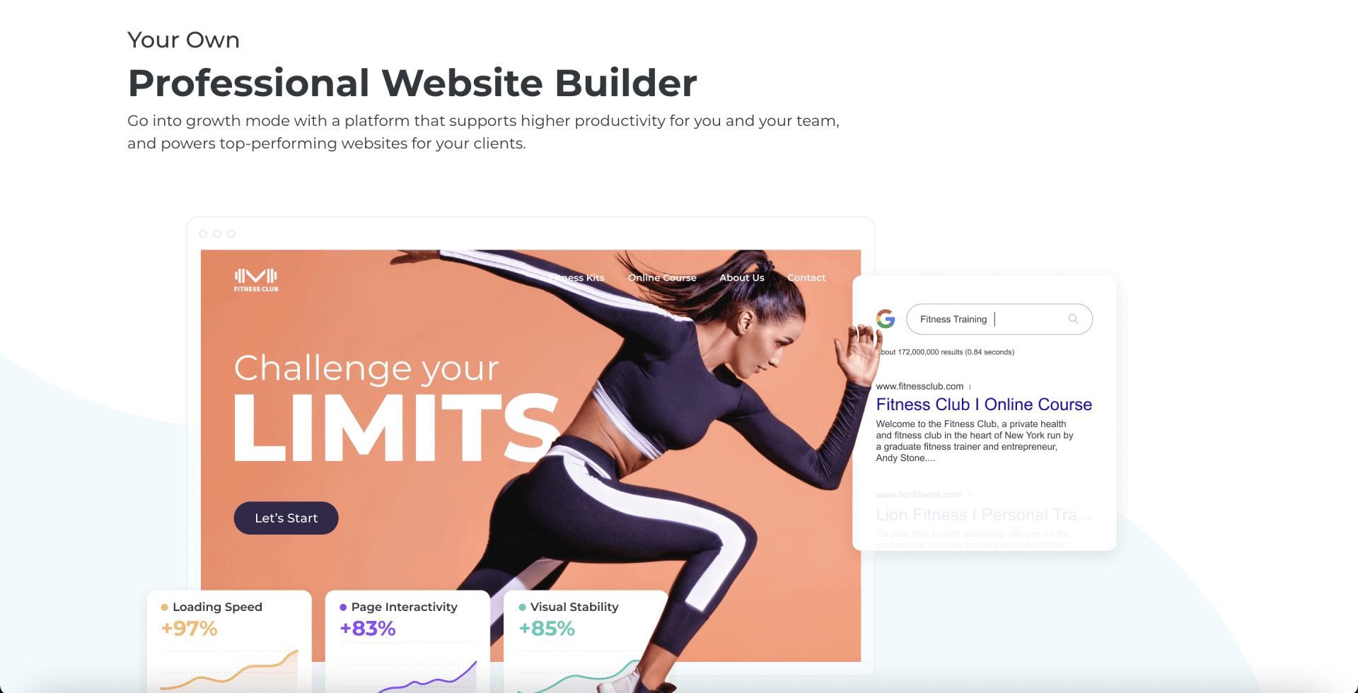
With more businesses joining the cyber world and many even taking birth from the web, you need a website with a reasonable conversion rate. An attractive web design is a first and most important step to attract more visitors and get them glued to the website to perform the call to action.
Designing a website for a company is a prime task and is defiantly not a piece of cake. Your marketing team may succeed in promoting your products, but if you do not have an effective website, all efforts will go in vain.
Your website should be a power pack of excellent web design and powerful content. Here are some tips and tricks for web design to be perfect for conversion:
1. Planning in detail:
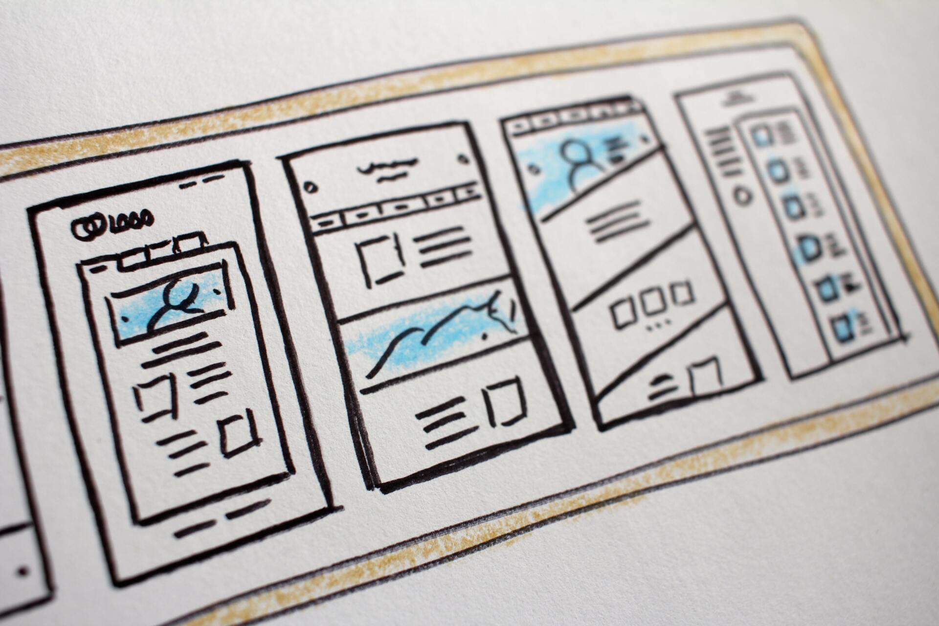
Detailed and organised planning of the website should be done before starting the designing process. It is always great to work rearward; this way, you can put efforts in the right direction to get the desired output.
Know about your customer's mindset, expectations, and behavior from your website. You should be aware of what things will likely attract the customers and make them stay on the website, navigate it and perform the call to action.
Web design derby agencies conduct several tests to understand the customers and then make the most straightforward, easy-to-use, and most attractive web designs.
2. Reduce confusion and lay it clear:
Making your website brimming with colours, animations, stocky images, and lengthy messages will do no good to your website. You need to understand that the simpler, the better. It is essential that the flow to navigate through the website comes naturally.
You would not want your customers to get distracted by useless animations and divert their minds from the actual purpose. Web design Leicester agencies work on specific guidelines and follow colour coding, specific font size, and style to prioritize call-to-actions.
Stuffing too much on the front page can be overwhelming for the customers and reduce conversion rates. Try to be straightforward with your message and make the navigation process explicit.
3. Add reviews and testimonials:
Would you be willing to buy something that you have not actually seen but have read and listened about it a lot?
You would want to give it a try. Your website will work the same way. You need to put up reviews and testimonials on your website for customers to make sure they will get what they expect.
How to include reviews and testimonials so that they get approached by the visitors?
Video testimonials are found to be more impactful. A catchy heading with a concise description of the video is sure to make the customer watch the video. You can also go for a text testimonial but make sure to add the customer name, picture, and company name, to increase authenticity and build trust.
4. Images make a huge difference:
Don't ever try to save up your time on images and go with stock photos. They are most likely to harm your website conversion rate. You would not like to see some images on two different websites or even your competitor's web page.
Redundant images can make you lose customers because this will decrease your credibility. Be conscious while choosing pictures for your website. Don’t go too overboard but stick with high-quality and realistic images. However, personal photography is best.
5. Do not make the visitors to put in extra effort:
Customers, in general, are lazy; do the work for them and help them continue being lazy. Try to reduce the clicks as much as possible and navigation translucent. You do not want the customer to run away because he does not want to click so many times to perform the call to action.
Try to prevent pop-ups and ads on your web page to reduce distraction and clicks. Web design Nottingham agencies make sure to not tire the visitors and make everything they are looking for visible and clear.
6. Use the white space effectively:
White space or negative space is the area between images and text. This empty space plays a vital role in designing the web page effectually.
Using the white space appropriately can create a visually appealing and pleasing web page. You can create partitions between contents and images using the white space. Moreover, you can use it strategically use it to emphasize on related content. White space can also be effectively used to create a minimalistic look. This way we are very close to increase conversion rate.
7. Include self-selection tools in your website:
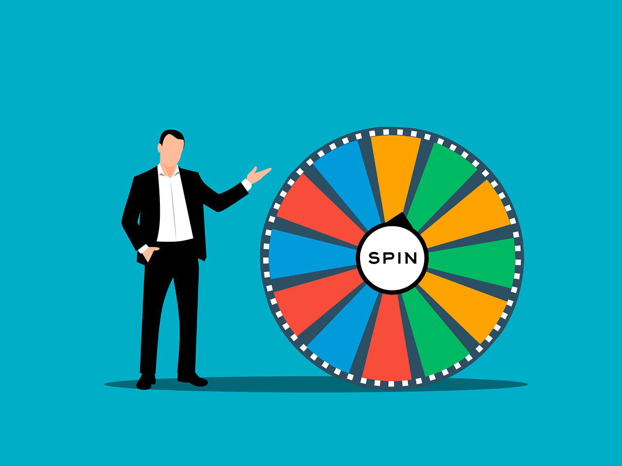
Online shopping can be overwhelming if you are not sure where to look for what you are looking for. An easy self-selection tool can help you narrow down your choices or even bring you to your desired product or service by asking a series of simple questions or making you checkbox your choices.
This is a simple tool but highly effective. The customers are sure to return for shopping more because of the ease they had while shopping using the self-selection tool.
Conclusion:
Invest your time to build up your website or hire professionals to do so because a good website plays a major role in attracting and increasing customer conversion. Make sure you have an attractive, appealing and easy to navigate website that will not tire or overwhelm the customers.
These tips will surely make you a pro to design an effective website that will be beneficial for your company. You do not have to worry any longer about your website. Just follow these simple tips and get ready for a huge boost in customer conversion rate.


